Adix provides you with these visualizations to help you with your analysis
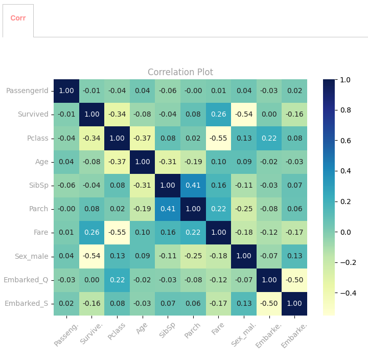
Heatmap correlation
It couldn’t be easier to just use the corr=True argument inside ix.eda().
This visualization depicts the correlation between all numerical variables within the DataFrame, offering valuable insights into the magnitude and direction of their relationships.
Furthermore, categorical variables undergo one-hot encoding to enable their inclusion in the correlation analysis. You can choose whatever variables you want to explore and analyze.
ix.eda(titanic,corr=True)
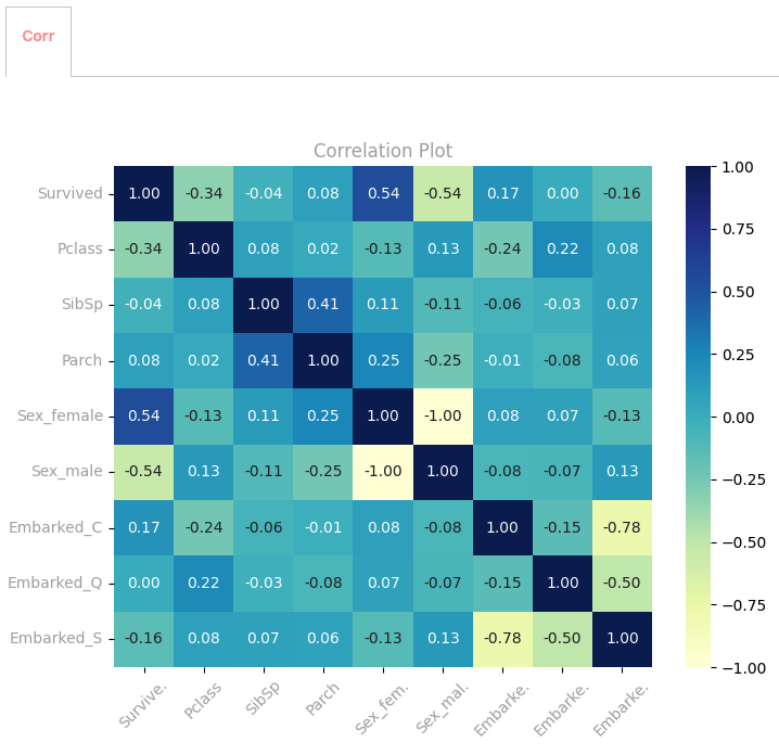
Variable-Specific Heatmap Correlation
Explore correlation heatmaps by focusing on specific variable types within the DataFrame, for both categorical and continuous variables:
ix.eda(titanic,vars='categorical',corr=True)
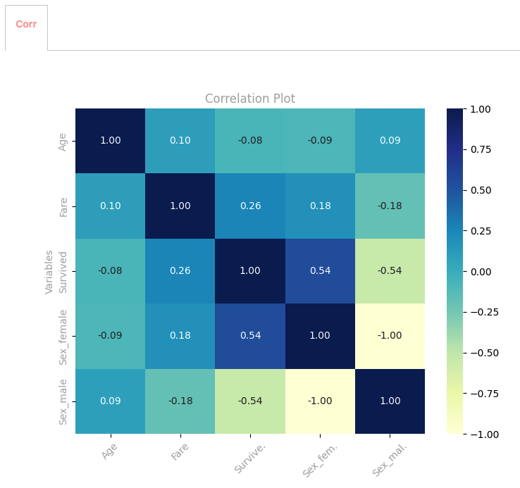
Custom Heatmap Correlation
You can also generate correlation heatmaps for selected parts of the DataFrame, focusing on specific variables of interest:
ix.eda(titanic.loc[:,['Age','Fare','Sex','Survived']],corr=True)