Adix provides you with these visualizations to help you with your analysis
Scatter Plot
ix.eda(titanic,'Age','Fare')
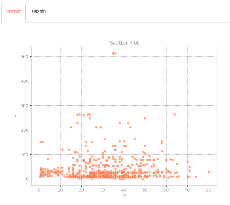
Scatter plots visually represent data points on a Cartesian plane, allowing for the exploration of relationships between continuous variables. By plotting each data point individually, scatter plots provide insights into patterns, correlations, and outliers. With Adix, analyze your data effectively and uncover meaningful insights using the Scatter Plot feature.
Hexbin Plot
ix.eda(titanic,'Age','Fare')
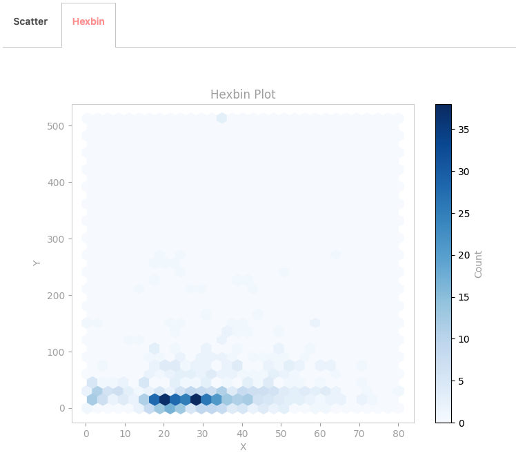
Hex bin plots aggregate data points into hexagonal bins, providing a simplified yet comprehensive view of relationships between continuous variables. This visualization helps identify trends, clusters, and outliers with clarity, empowering informed decision-making. With Adix, analyze your data efficiently and uncover valuable insights using the Hex Bin Plot.