Adix provides you with these visualizations to help you with your analysis
Heat Map
ix.eda(titanic,'Sex','Survived')
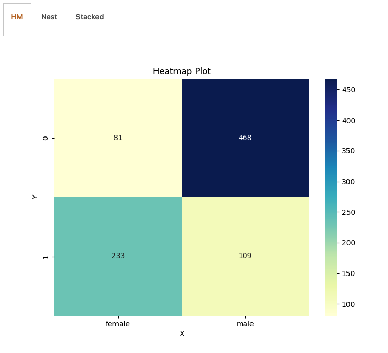
Visualizing relationships between variables through color intensity, heat maps offer a comprehensive understanding of your data’s patterns and correlations.
Easily identify clusters, trends, and outliers, empowering you to make data-driven decisions with precision. With Adix, harness the full power of heat maps to elevate your data analysis to new heights.
Nested Bar Chart
ix.eda(titanic,'Sex','Survived')
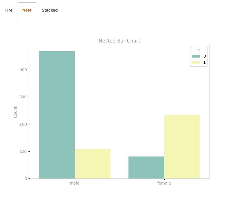
It allows you to explore relationships between multiple categorical variables in a single, easy-to-understand chart. By nesting bars within each category, the chart unveils the hierarchical structure of your data, enabling you to identify patterns and trends with clarity.
Stacked Bar Chart ( percentege )
ix.eda(titanic,'Sex','Survived')
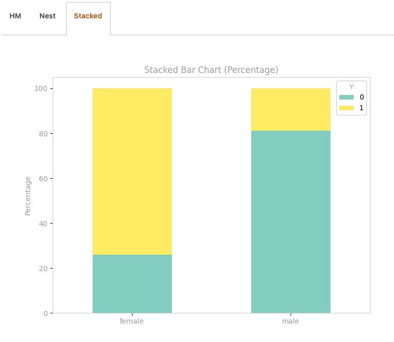
Easily visualize the composition of categorical variables and their relative proportions within each category. With this chart you gain deeper insights into your data distribution and make informed decisions backed by precise, percentage-based analysis.